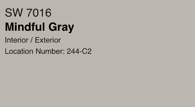
Mindful Gray SW 7016 – A Beautiful Warm Gray
Sherwin Williams Mindful Gray is in the neutral paint color family and is a stunning mid-tone gray that looks beautiful in any room and lighting. Gray paint colors can often pull strong undertones, so it’s essential to research when looking for neutral grays.
After reading this post, you will better understand how Mindful Gray looks in different lighting and if it is the right paint color for you.
Get more painting project tips here.
SW 7016 Mindful Gray Details
| DETAILS | |
| R | 188 |
| G | 183 |
| B | 173 |
| Hex Value | #bcb7ad |
| LRV | 48 |
| Color Collections | Nurterer |
What do these readings mean?
- The R G B are the combinations of red, green, and blue.
- Hex value is the same as the red, green and blue values, except in hexadecimal numbers.
- LRV is light reflectance value. Zero is absolute black and 100% is perfectly reflective white. At 48, Mindful Gray is a fairly mid-value paint color on the LRV Scale.
- SW-2016 is in the Color Collection of Nurturer. Sherwin Williams describes the color collection Nurturer as “Your warm smile and compassionate nature define you. You care for people, and nothing is more important to you than making your friends and family feel at home. This is you. This is your Color ID.”
What are the Undertones of Mindful Gray
The undertones of Mindful Gray are generally neutral. It is considered a warm paint color / warm gray, but it can occasionally look a tad bit cool in certain lighting.
It will also pull a tiny bit of blue (but very slight blue undertones!).
The blue undertone is so subtle, I wouldn’t worry about this gray looking too blue.
I have read some feel it has a purple undertone. This is something I have not personally seen, so it’s important to get samples to try in any space prior to committing.
Depending on the lighting, slight green undertones could be noted. Once again, I only note greige undertones in my space. This is a great example of why it is always crucial to get samples of the actual paint colors to view in your space before painting an entire room.
You want to be 100% satisfied with your paint shade color selection to avoid having to paint a space again.
Is Sherwin Williams Mindful Gray Warm or Cool
As I mentioned above, it is considered a warm gray but neutral would be a better way to describe it as it does pull slightly cool in certain lighting.
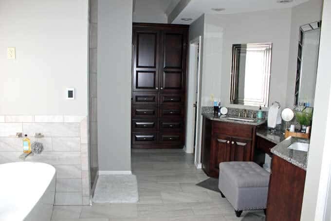
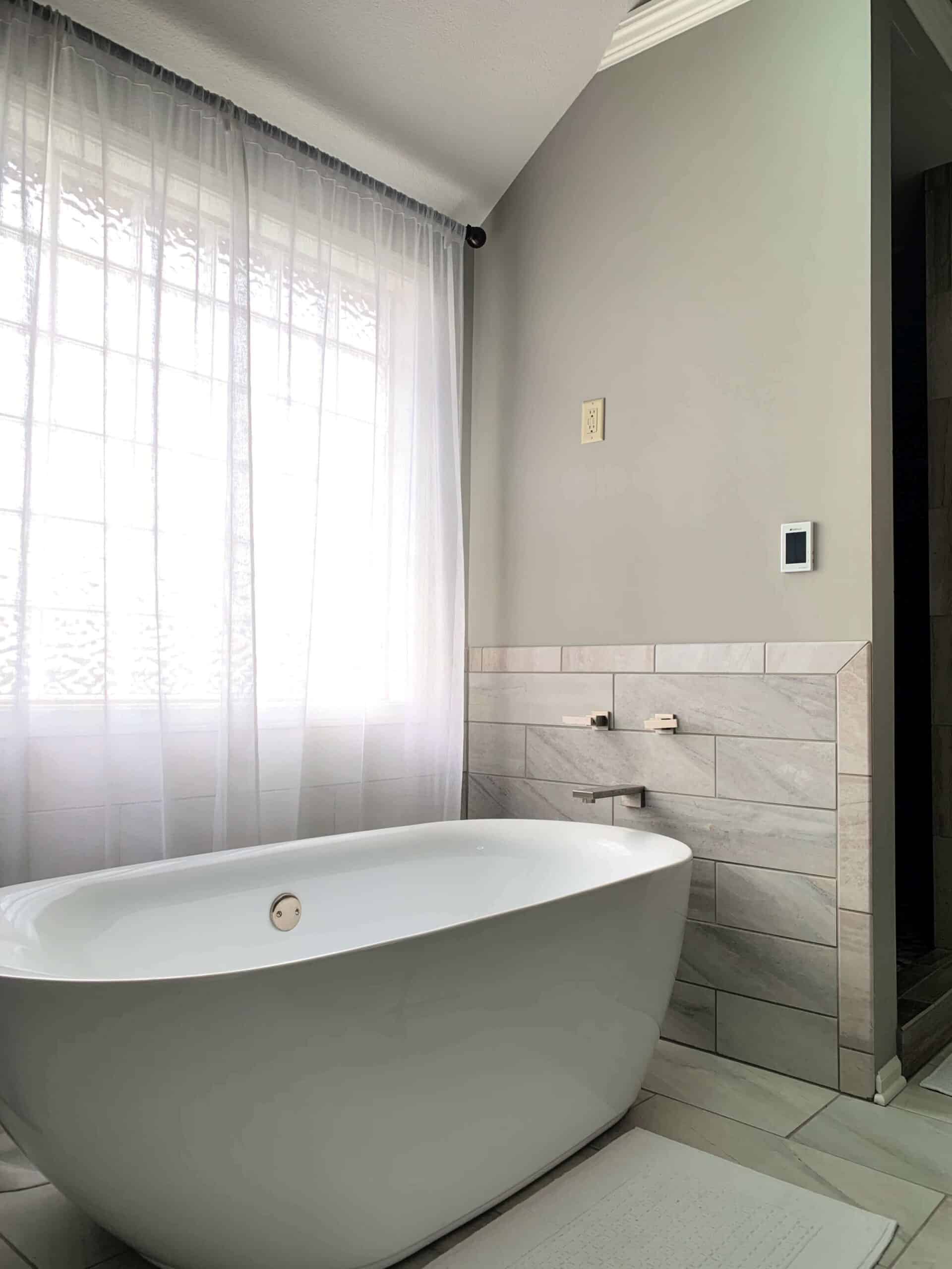
We used Mindful Gray in my master bathroom and LOVE it! It is the perfect combination of warm undertones and cool undertones. The room doesn’t look sterile in any way.
I would 100% pick this color again.
Our bathroom has some nooks and crannies that get next to no natural light and other areas of the bathroom that get a flood of sunlight.
This Sherwin Williams gray truly looks great in all areas and remains neutral.
Is Mindful Gray a Greige
Yes, Mindful Grey is a very pretty greige. Because it is so neutral, with a bit of warm and cool feel, it is a nice combination of gray and beige.
As a matter of fact, SW Mindful Gray would be a great color to go with if you are in the process of transitioning your home from browns to grays.
It plays very nicely with both colors!
What trim color goes with mindful gray
This will depend on if you prefer a very white trim color or lean more towards a creamy trim color. I’ll give you my pick for both.
Keep in mind finding a trim color you love can be even more tricky than picking a wall color.
My suggestion would be to get samples and compare them in the space.
Also when it comes to white, it is always a good idea to compare the paint color against something you know is a true white like a piece of copy paper.
I lean toward liking the whiter whites as I feel it is more classic.
But, you find what you love and go with it. It is best to pick a trim paint and stay consistent throughout your entire home.
You also want a trim color that is fairly neutral and classic should you decide to repaint your walls a totally different color some time down the road.
Painting trim for an entire home is A LOT of work.
Trim colors that are more “white”:
- SW 7005 Pure White LRV: 84
- Benjamin Moore Simply White LRV: 91.7 (this is the trim color in my master bathroom and I LOVE it.)
- Benjamin Moore Chantilly Lace LRV: 92.2 Considered a crisp, clean white.
White trim colors that have a hint of creaminess:
- SW 7008 Alabaster LRV: 82
- White Dove OC-17 – Benjamin Moore LRV: 85.38
Mindful Gray Coordinating Colors
As previously mentioned, this paint color is a great neutral that can coordinate with cool and warm color schemes.
Sherwin Williams has outlined colors they believe coordinate really well and are as follows:
- SW 7009 Pearly White
- SW 7622 Homburg Gray
- SW 7014 Eider White
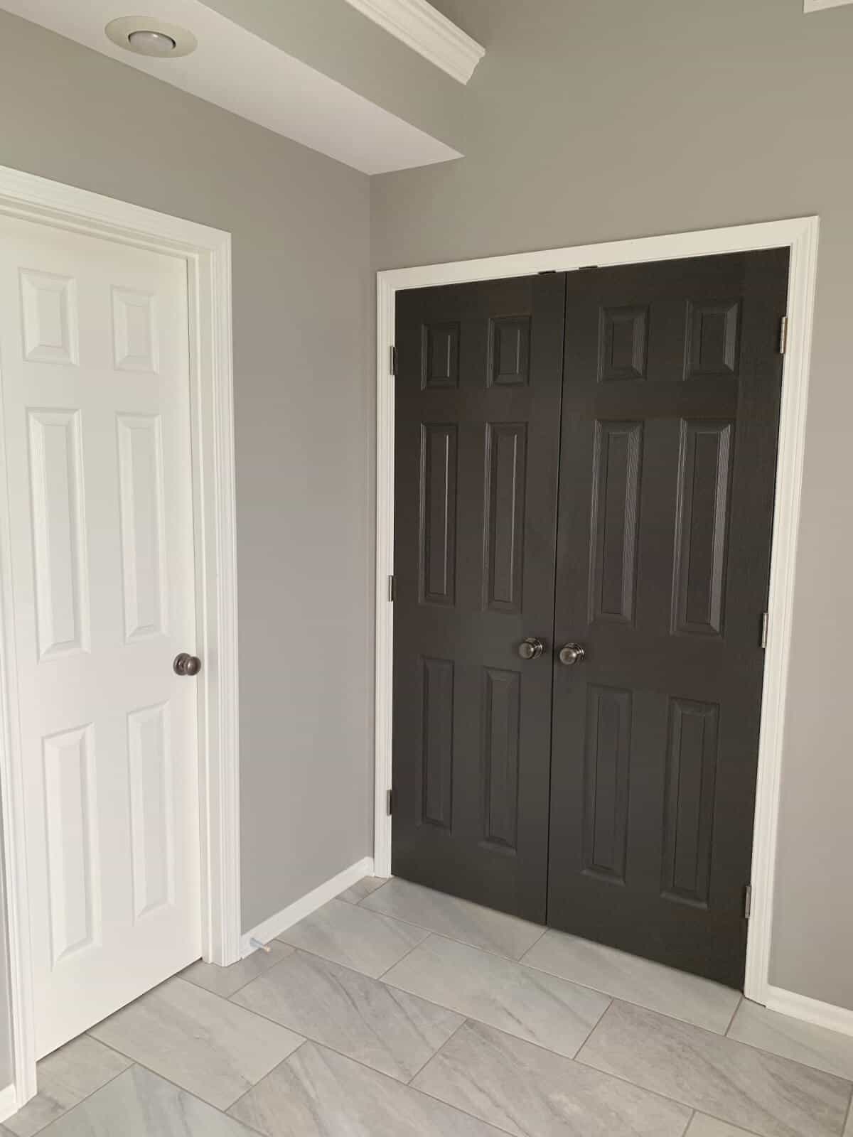
If looking for a very dark color to coordinate try SW 7020 Black Fox (the darkest color on the same color swatch) or SW 7048 Urbane Bronze.
We used Urbane Bronze in our bathroom to paint the french doors leading to the bedroom.
It is a great paint color.
Mindful gray and lighting
This paint color stays incredibly consistent despite of the changes with lighting.
Regardless of the amount of sunshine, or if it is day or night, it remains neutral and continues to be a lighter mid-tone shade of gray.
So, it is safe to say this color will work nicely in north-facing rooms, east, south, or west lighting.
Even in artificial light!
Mindful Gray vs Repose Gray
When looking on the color swatch, Sherwin Williams Repose Gray is the color just a shade lighter while Dorian Gray is the color that is just a shade darker.
Mindful gray is certainly more mid-tone.
If you are deciding between these two colors, know they are both very pretty and neutral.
Repose Gray has a LRV (light reflective value) of 58 while the LRV of Mindful Gray is 48.
Colors above 50 are lighter and reflect more light in a room.
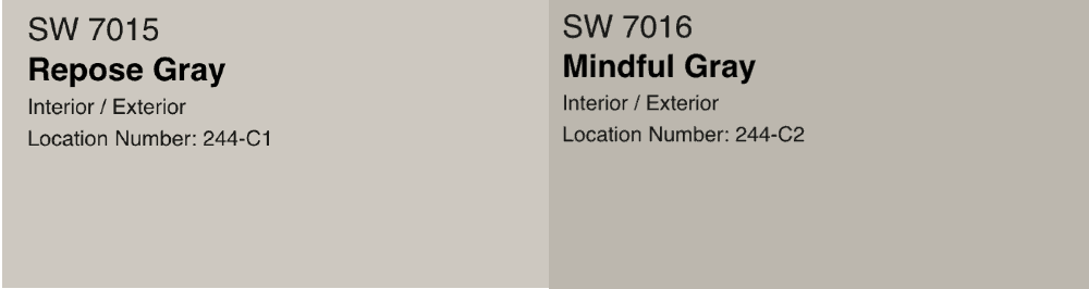
SO, if you have a room that doesn’t get a lot of sunlight and you want to brighten it up a bit, you might want to go with a shade with a higher LRV such as Repose Gray.
It truly is dependent on what you are hoping to achieve with the feel/look of the room.
Although Mindful Gray is very neutral, in a room that gets very little natural light it might require more lamps/artificial lights on dark cloudy days than Repose Gray would.
In my opinion, both colors are a winner that will give you a sophisticated feel. It comes down to your opinion in wanting a lighter vs. mid-tone gray.
The best color is the color that works best in YOUR space.
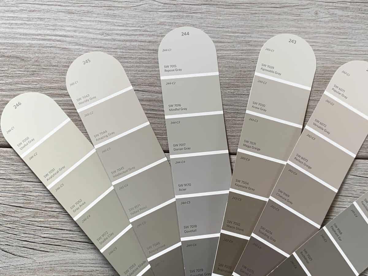
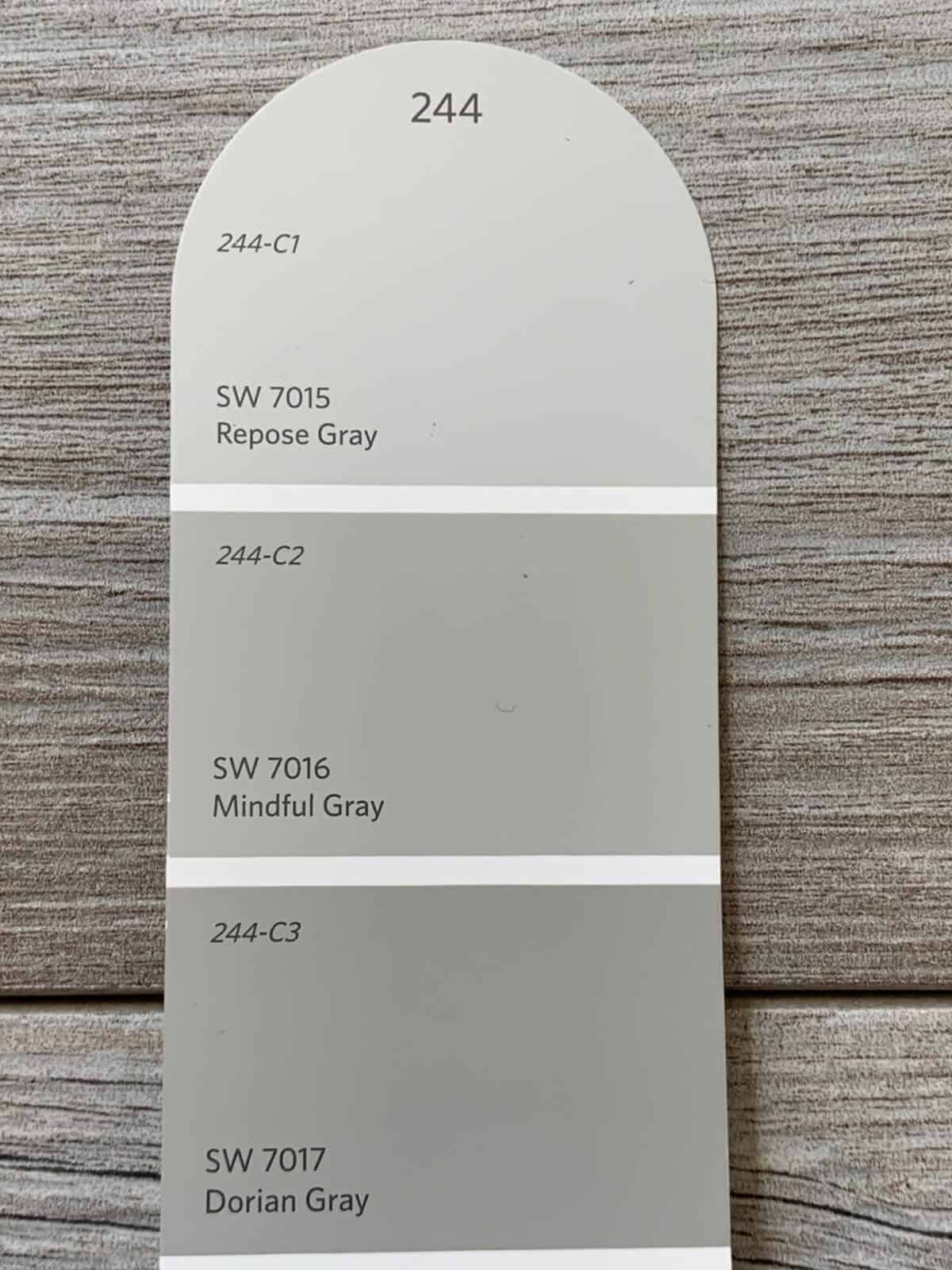
Mindful Gray Color Strip
The color strip is 244 in the Sherwin Williams color fan deck. In my opinion, all of the colors on this particular strip are stunning.
The colors on this strip from lightest to darkest:
- SW 7015 Repose Gray
- SW 7016 Mindful Gray
- SW 7017 Dorian Gray
- SW 9170 Acier
- SW 7018 Dovetail
- SW 7019 Gauntlet Gray
- SW 7020 Black Fox
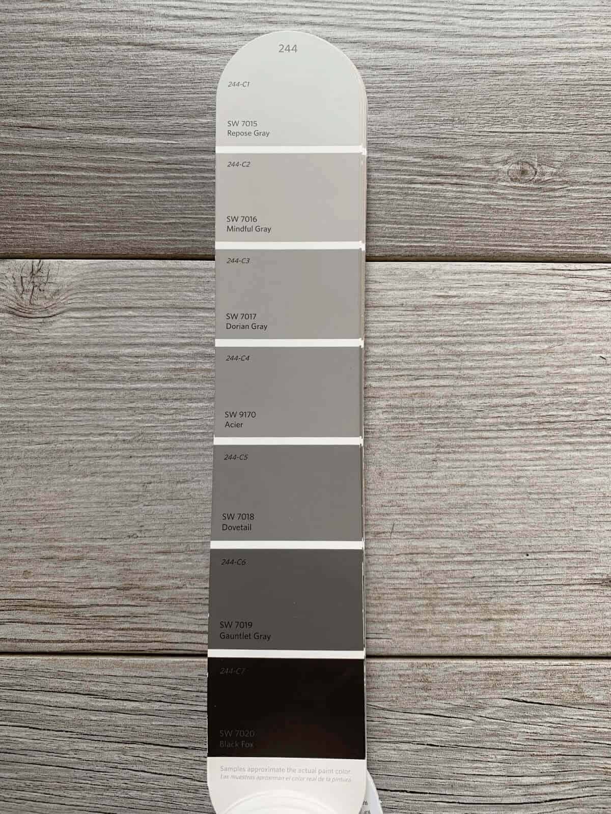
Popular darker colors on the same color strip are Dorian Gray SW 7017 and Black Fox.
I used Black Fox to paint our garage doors many years ago and really loved the color.
When it was time to repaint due to fading, I went with Urbane Bronze because I had a lot of paint left over from painting our front door.
Both colors are beautiful and similar in many ways.
But, if you are starting from scratch and picking paints that go together perfectly, staying on the same strip is typically a safe bet.
The darkest color on any paint strip will give you a pretty good idea of the undertones of all of the other colors on a given strip.
In this case, Black Fox is the darkest. It is certainly neutral, almost a mix between a soft black/charcoal and dark brown.
Mindful Gray Paint Swatch
If you are trying to find the paint swatch it is SW 7016. On the Sherwin Williams color fan it is color strip 244, specifically 244-C2.
Another way to match the color is by using the hex value. Mindful Gray hex is #bcb7ad.
Mindful Gray Interior
Mindful Gray makes it a great choice for an interior space if you are searching for a mid-tone color.
As I’ve covered before, it so neutral that it really fits well in any location and interior space, regardless of how much or little light that room will get.
It’s a great choice for bathrooms, kitchens, bedrooms, dining room, and even cabinetry.
The depth of the color provides a cozy feel for certain without feeling dark and dreary.
Mindful Gray Kitchen Walls
This color would work beautifully in a kitchen, particularly a kitchen receiving a lot of natural light.
Whether you are deciding on Mindful Gray for the kitchen walls or cabinets, this color is a good choice.
The neutral gray looks stunning with white and coordinates beautifully with warm or cool color schemes.
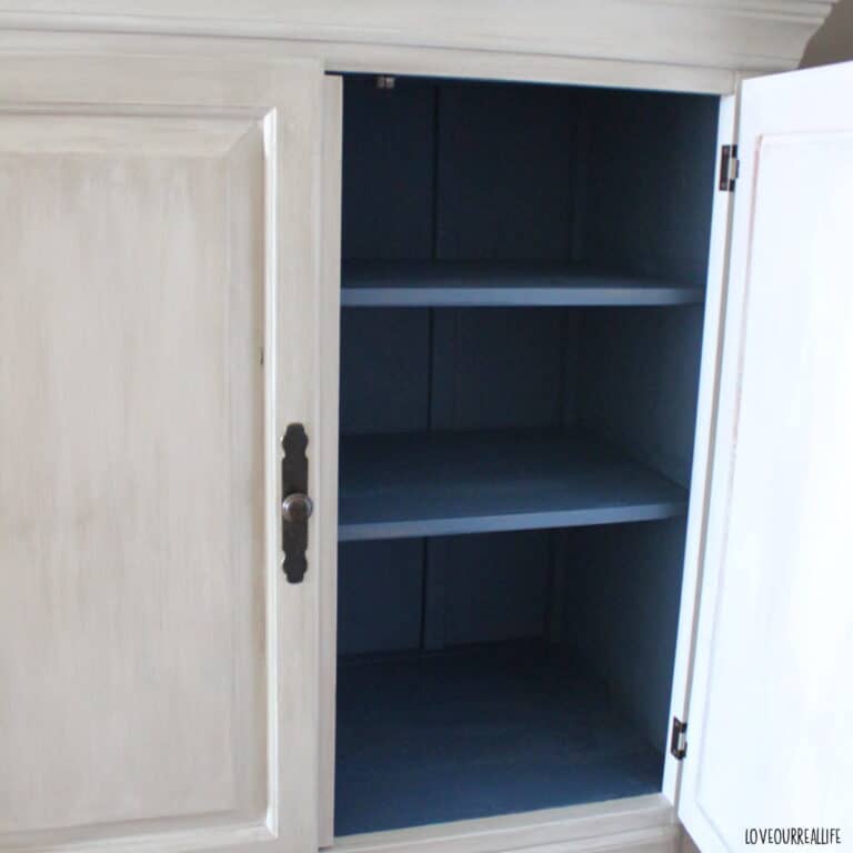
Sherwin Williams Mindful Gray Cabinets
When researching for this post, I spent so much time seeing images of the color in lots of different spaces.
When I finally get the time (and my husband’s permission!), I’m strongly considering using this color to paint my kitchen cabinets.
It is dark enough to give a nice contrast with light colored walls while not overpowering the space and making it seem too dark.
Mindful Gray Bedroom
Refreshrestyle has a pretty bedroom that shows how this color can remain neutral, yet still feel warm and cozy!
The colors she used to decorate the bedroom really make everything seem bright and inviting.
Mindful Gray Bathroom
I think you are getting the picture that I love this color in our bathroom. It is dark enough to make the space feel nice and cozy while simultaneously feeling light and clean.
Our bathroom is oddly shaped, causing some of the corners to not get a lot of natural lighting.
Even with this issue, the color is perfect. It’s certainly not a light color, but just light enough.
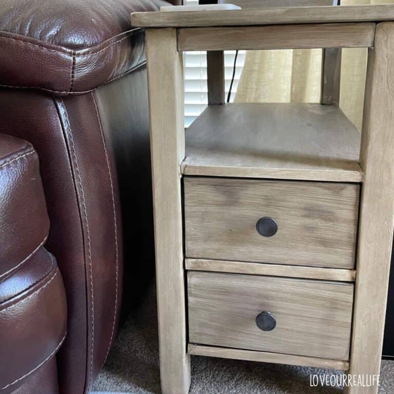
Mindful Gray on Furniture
If you love the look of this color on woodwork and cabinets, you will love it on furniture.
Since it is a mid-level gray, it would work well in many rooms and make a stunning furniture piece.
It would look fabulous to use this color for a two tone look with a pretty bright white paint. Perhaps on a chest of drawers, night stand, or hutch.
Mindful Gray on the Exterior of a Home
This color is just as beautiful on the exterior of a home as it is the interior. Bright white trim gives it a stunning and clean look.
Dark garage doors and a dark colored front door tie it all together nicely.
What color is true gray at Sherwin Williams
As I’ve mentioned before, you will want to sample any color in the space prior to making the move to paint.
Why?
Different lighting, floor coloring, decor color scheme, etc. can have an impact on the way the color will look in the end.
But, if you are looking for some options for a ‘true gray’ in the Sherwin Williams line, consider the following:
- SW 7016 Mindful Gray (the popular gray I’ve featured here today)
- SW 7015 Repose Gray (the color one shade lighter on the color palette than Mindful Gray)
- SW 7654 Lattice
- SW 7029 Agreeable Gray (Sherwin Williams top selling paint color, a very popular gray)
What gray paint color is most popular Sherwin Williams
According to Sherwin Williams, the top 10 paint colors (not just gray) are as follows:
- SW 7029 Agreeable Gray
- SW 7015 Repose Gray
- SW 7036 Accessible Beige
- SW 6258 Tricorn Black
- SW 6106 Kilim Beige
- SW 7016 Mindful Gray
- SW 7043 Worldly Gray
- SW 0055 Light French Gray
- SW 7030 Anew Gray
- SW 7017 Dorian Gray
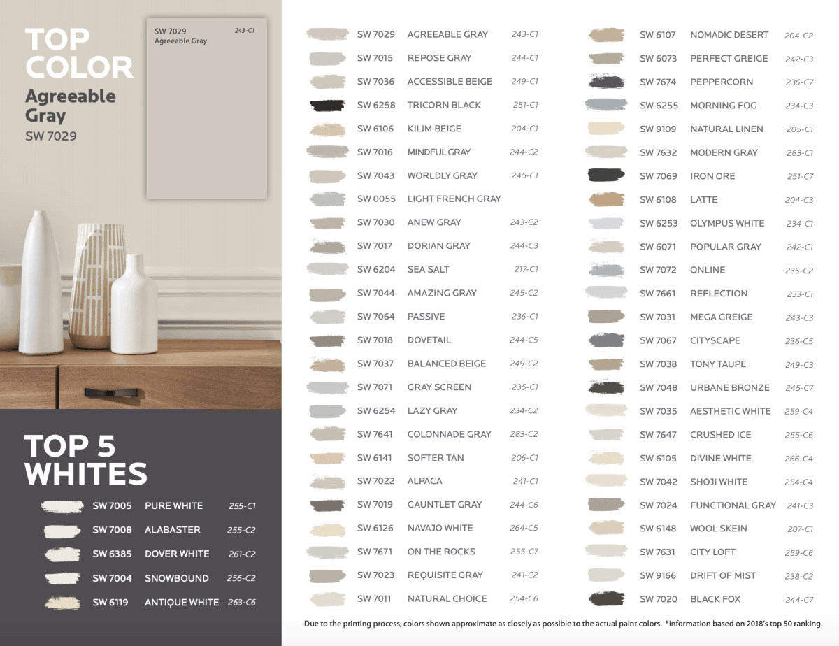
Sherwin Williams also listed their top five selling white paints:
- SW 7005 Pure White
- SW 7008 Alabaster
- SW 6385 Dover White
- SW 7004 Snowbound
- SW 6119 Antique White
Sherwin Williams Mindful Gray Review
It’s a gorgeous mid-tone gray!
I hope you have gotten the idea of how this pretty gray color can be used in nearly every space and remain neutral. The perfect mix of warm and cool.
Grab some paint samples and see what you think in your home!
Don’t forget to pin this to your favorite home decor Pinterest board for later!

Do you have a “perfect gray”? If so, drop me a note below and tell me your review of the color.
Thanks for joining me today. Don’t forget to drop by my FaceBook or Instagram page and say hello. Hearing from you all is always a light for me!